Choosing Poster Sets for a Balanced Arrangement: Key Tips for Effective Design
Share
Creating a visually appealing space involves careful consideration of how your artwork is arranged. When it comes to choosing poster sets, consider combining different sizes and themes to maintain a balanced arrangement. This approach adds depth and interest to your décor, allowing your personal style to shine through.
A successful poster display harmonizes various elements, such as color, subject matter, and shape. By selecting complementary pieces that resonate with you, you can cultivate a space that feels cohesive and inviting. The Wild Rose Gallery offers a wide range of striking designs that make it easy to forge a deeper connection with your home or office.
To elevate your arrangement further, pay attention to the layout and spacing of your posters. Consider factors like sightlines and negative space to create an intentional look. With the right combination from The Wild Rose Gallery, your walls can transform into a captivating gallery that reflects your unique aesthetic.
Understanding Visual Balance in Poster Arrangements
Visual balance is crucial for creating harmonious poster arrangements. It involves distributing visual elements effectively to avoid clutter and enhance the aesthetic appeal of your space. Here's how you can achieve this balance.
The Importance of Visual Weight
Each element in your poster arrangement carries a certain visual weight, which affects how your overall design feels. Visual weight can come from size, color, and shape. For instance, darker colors often appear heavier than lighter ones, while large pieces dominate space more than smaller ones.
When planning your layout, consider how these weights interact. Avoid clustering too many heavy elements together. Instead, distribute them evenly across your arrangement to maintain a sense of equilibrium. This strategy helps create a visually engaging experience that draws viewers in rather than overwhelming them.
Achieving Symmetry and Asymmetry
Symmetry involves mirroring elements on either side of a central axis, creating a sense of stability. This can be effective for achieving a classic, calm look in your poster arrangement. For example, if you have two large posters of equal size on either side of a central piece, they create visual harmony.
In contrast, asymmetry can be used to create interest and dynamism. By arranging various sized posters with varying colors and textures, you can capture attention while maintaining balance. The goal is to ensure that no single element overshadows another, allowing each piece to contribute to the overall composition.
Establishing a Focal Point
A focal point is essential for guiding the viewer’s eye and providing a center of interest in your arrangement. This can be achieved through the use of a particular piece that stands out in size, color, or design.
When creating your layout, choose a key piece that resonates with you—something that embodies the vision of your space. Position this piece strategically within the arrangement to draw the viewer’s gaze. Surround it with complementary elements that support its impact without detracting from it. This results in an engaging visual journey through your poster set.
Selecting Poster Sets for a Cohesive Look
A cohesive look in your space can be achieved through thoughtful selection of poster sets. Consider themes, color palettes, and styles to create harmony throughout your environment.
Choosing Themes and Color Palettes
Begin by identifying the themes that resonate with you. Nature, abstract, or vintage styles can evoke different moods and set the tone for your space. Choose a color palette that complements your existing decor.
For instance, if your room features earthy tones, select posters with greens, browns, or soft blues. Harmonizing tones and themes between your posters and wall art enhances visual appeal. Using a consistent palette can create a seamless connection across different art pieces.
Coordinating Posters by Style
Next, coordinating poster styles is essential for a balanced arrangement. Mixing different styles is possible, but it should be done with intention. Pair similar elements—such as prints that share a common motif or texture—to create visual unity.
For example, if you choose a modern abstract piece, complement it with other contemporary designs. Similarly, rustic posters can enhance one another when framed in natural finishes. This thoughtful coordination fosters a cohesive aesthetic.
Mixing and Matching Poster Types
Lastly, mixing poster types adds depth to your wall displays. Consider combining canvases with traditional paper posters to diversify textures and formats. This approach enhances the overall visual intrigue of your arrangement.
Ensure the combined pieces align with your chosen themes and colors. Incorporating various sizes can also lead to a dynamic display. Play with different orientations, such as landscape and portrait, to keep the eye engaged. This variety creates an inviting and personalized gallery in your home or office.
Determining Poster Size and Scale
Choosing the right poster size and scale is essential for creating a balanced arrangement that enhances your space. Careful consideration of wall dimensions, furniture proportions, and the impact of oversized pieces will ensure your artwork stands out in a way that feels harmonious and intentional.
Assessing Wall Space and Dimensions
Begin by measuring your wall area to determine the available space for your posters. Consider the height and width of the wall as well as any obstructions like windows or doors. Ideally, your artwork should occupy 60-80% of your wall surface for a balanced appearance.
A simple way to visualize your layout is to use painter’s tape to outline the desired dimensions directly on the wall. This technique allows you to experiment with placement before making a final decision.
Proportion Relative to Furniture
When selecting poster sizes, think about the size and style of your furniture. Your artwork should complement your furnishings rather than compete for attention. For example, if you have a low-profile sofa, opt for larger posters to create a striking focal point above it.
Conversely, small pieces may be more appropriate for higher furniture, like bookshelves or cabinets. The artwork's scale should relate to the furniture's height and width; this ensures continuity and visual stability in the room.
Selecting Oversized or Smaller Posters
Oversized posters can make a bold statement, but they should be used wisely. An oversized canvas can draw attention and create a focal point, making it suitable for larger spaces or walls that feel empty. A single, large piece works well as a dramatic centerpiece.
If you prefer smaller posters or a gallery arrangement, ensure the sizes vary to maintain visual interest. Grouping smaller pieces can create a dynamic look. Just ensure they’re proportioned in relation to each other and the surrounding space for a cohesive arrangement.
Planning Art Placement for a Balanced Arrangement
Creating an inviting atmosphere involves careful planning of art placement. Thoughtful arrangements can enhance the aesthetics of your space while ensuring a harmonious balance. Focus on precise techniques to achieve an appealing layout that highlights your chosen posters.
Arranging Posters at Eye Level
Positioning artwork at eye level is crucial for maximizing visual impact. Generally, this height aligns with the average person's line of sight, which is around 57 to 60 inches from the floor. Use this guideline when selecting the placement for your posters.
When grouping multiple pieces, maintain this eye-level standard collectively. For instance, the center of a gallery wall should align with this height. This approach creates a cohesive look, making it easier for viewers to appreciate the artwork without straining their necks.
Spacing and Alignment Techniques
Consistent spacing between your posters contributes to a balanced display. A common recommendation is to maintain 2 to 4 inches between each art piece. This distance helps prevent overcrowding and ensures that each artwork stands out.
Consider using a level when hanging your posters. This simple tool can make a significant difference in achieving a straight and uniform alignment. You can also visualize the layout by using painter's tape to outline where each piece will hang before puncturing your walls.
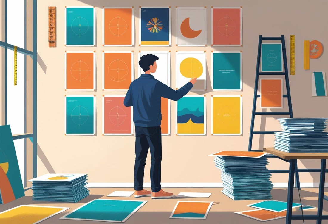
Incorporating Gallery Wall Layouts
Gallery walls allow for a vibrant mix of styles and sizes, making them an exciting choice for art placement. Start by laying out your posters on the floor, experimenting with combinations until you find a layout that resonates.
Incorporate a variety of frame styles that complement your artwork while keeping some consistency. For example, you might choose a unified color palette for your frames, which ties the collection together. The Wild Rose Gallery offers stunning framed options that can enhance your arrangement.
As you finalize the layout, be mindful of balancing larger pieces with smaller ones to prevent visual heaviness on one side. Arranging your wall art with intention creates a striking focal point that transforms your space.
Practical Tips for Displaying and Updating Poster Sets
Creating a visually appealing arrangement of your poster sets requires careful consideration of the framing, mounting, and placement. Here are essential tips to enhance your display and keep it fresh over time.
Selecting Frames and Mounting Options
Choose frames that not only protect your art but also complement your overall decor. Opt for oak frames for a classic touch, providing durability and style. Ensure that the frame width is proportional to the poster size, generally 2-4 inches wider on each side for balance.
For mounting, consider options such as adhesive strips or traditional hooks. Adhesive strips offer a non-damaging approach, ideal for temporary displays. If you prefer a more permanent solution, use hooks that can support the weight of your framed art securely.
Additionally, explore mounting directly on the wall using techniques like floating frames for a modern look. This method can create depth and an illusion of spaciousness in your room.
Adapting Arrangements for Different Rooms
Each room has its unique vibe, and your poster arrangement should reflect that. In a living room, create a bold statement with larger posters as focal points. Use a cohesive color palette that ties together the artwork with your furnishings.
For a workspace, opt for motivational posters that inspire productivity. Arrange them at eye level to catch your attention while you work. Mixing sizes and orientations can add visual interest while ensuring that each piece captures your focus.
In a bedroom, softer tones and calming images work well. Arrange pieces symmetrically for a balanced look or in a casual cluster for a more relaxed feel. Regularly update these arrangements to keep the space feeling fresh and inviting.
Adjusting Lighting for Visual Impact
Lighting significantly impacts the way your posters are perceived. Natural light can enhance colors and details, but direct sunlight may fade them over time. Consider using tempered glass in frames to mitigate this risk.
Position your posters near soft, ambient lighting to create a warm atmosphere. Adding spotlights can draw attention to specific pieces, allowing their features to stand out. Experiment with different light sources to find the best balance for viewing comfort.
Use dimmers to adjust brightness based on the time of day or mood you want to create. Thoughtful lighting can transform your poster sets, making them integral parts of your home or office decor.
Frequently Asked Questions
This section addresses common inquiries regarding poster arrangements, design principles, and effective placement strategies. Gain insights into how to achieve visual harmony and make impactful design choices.
How to arrange posters in a bedroom for visual harmony?
To create visual harmony in your bedroom, consider symmetrical arrangements above the bed. Use a combination of sizes that complement each other, ensuring that colors and themes resonate with your overall decor. Balance larger pieces with smaller ones to maintain a cohesive look.
What are the design layout principles to consider when creating a poster?
When designing a poster, focus on alignment, contrast, and balance. Use appropriate spacing between elements to avoid clutter. Consider the visual flow to guide the viewer's eye from one area to another, enhancing the overall impact of the poster.
What are five essential qualities of an effective poster?
An effective poster should be visually appealing, informative, and easy to understand. Clarity in messaging is crucial. High-quality graphics and a strong focal point will draw attention. It's also important for the design to reflect a cohesive theme that resonates with your target audience.
What guidelines should students follow to make a compelling poster?
Students should prioritize clarity and legibility in their posters. Use large, readable fonts and limit text to key points. Incorporate visuals that support the message, and ensure a balanced layout to capture attention effectively.
How do you determine the best placement for posters in a room?
Assess the available wall space and consider the height at which the posters will be viewed. Ideally, center the artwork at eye level. Consider the surrounding decor and furniture to ensure the posters enhance the overall aesthetic of the room.
What are the three fundamental layers involved in a good poster design?
A well-crafted poster typically includes three layers: background, main content, and focal points. The background sets the tone, while the main content conveys the primary message. Focal points draw the viewer's attention and enhance engagement with the design.