Mixing Poster Sizes for Dynamic Wall Decor: Tips for Creating Striking Displays
Share
Mixing poster sizes is an effective way to create dynamic wall decor that reflects your personal style. By combining various sizes and orientations, you can achieve a balanced and visually striking gallery wall that captivates attention. This approach not only enhances the aesthetic appeal of your space but also infuses it with character and personality.
As you consider your layout, remember that larger posters can act as focal points, while smaller pieces can complement them harmoniously. Experimenting with different dimensions allows you to fill spaces creatively and ensure your walls tell a story. Whether you're looking to make a bold statement or simply add depth to your decor, the possibilities are endless.
The Wild Rose Gallery offers a range of posters designed to inspire connection to your environment. Choose art that resonates with you and transforms your wall into a conversation starter. With the right mix of sizes, your walls can come alive with energy and style, inviting admiration from all who enter.
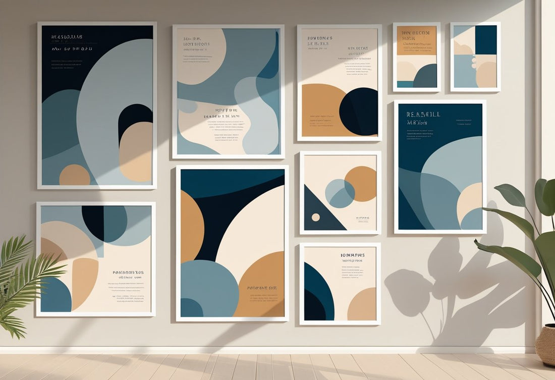
The Art Of Mixing Poster Sizes For Dynamic Walls
Mixing poster sizes can transform your wall decor into a captivating visual experience. Understanding how to balance different dimensions, create focal points, and use proportion effectively enhances the overall aesthetic of your space.
Understanding Balance And Visual Interest
Creating balance in your wall decor is essential for visual interest. You should consider mixing various poster sizes to achieve harmony. Use larger posters as anchors to draw attention.
Smaller pieces can fill gaps and complement the larger displays. Aim for a mix of vertical and horizontal orientations to create an engaging layout.
To enhance visual interest, incorporate different styles and themes that resonate with you. This approach maintains a cohesive look while allowing for diversity in your artwork.
How Poster Sizes Impact Aesthetic And Focal Points
The sizes of your posters significantly affect your room’s aesthetic. Large posters can dominate a space, serving as focal points that draw the eye.
Consider placing these larger artworks at eye level to capture immediate attention. Smaller posters can then surround them, creating zones of interest without overwhelming the viewer.
Utilizing contrasting sizes adds depth and dimension to your display. For a cohesive look, ensure that your color palette ties various sizes together, creating a unified aesthetic that reflects your personal style.
Proportion And Scale In Wall Decor
Proportion and scale are crucial elements in wall decor. When selecting poster sizes, think about the size of the wall and surrounding furniture.
A large wall can accommodate oversized pieces or clusters of smaller posters. Conversely, smaller rooms benefit from a cluster of compact frames that maintain intimacy.
Use a mix of sizes to achieve visual balance. Ensure that the distribution of large and small pieces doesn’t favor one side, as this can create an unbalanced look.
Experiment with different arrangements until you find a combination that feels right. Mixing sizes not only enhances aesthetic appeal but also expresses your unique taste. Transition your space with striking designs that speak to your individuality, embracing the artistry of dynamic wall decor.
Gallery Wall Layouts: Creating Structure And Flow
Creating a dynamic gallery wall requires a thoughtful approach to layout. By applying specific techniques, you can achieve both structure and visual flow, making your wall art truly stand out.
Rule Of Thirds For Wall Art Arrangements
The Rule of Thirds is a fundamental principle in art and photography that can greatly enhance your gallery wall. Imagine dividing your wall into a 3x3 grid. By placing key pieces at the intersections or along the lines, you create a more balanced and engaging display.
Start with a focal point, such as a large poster or piece of art. Place this element in one of the grid’s intersection points. Arrange smaller frames around it, utilizing other intersections to create a cohesive look. This method draws the eye naturally across the wall, enhancing the overall visual impact of your gallery.
Tips For Arranging Small Frames And Large Posters
Mixing small frames with large posters can create an interesting, dynamic composition. Begin by selecting a large piece as an anchor. This will serve as the central element around which you build your layout.
When incorporating smaller frames, vary their sizes and orientations for depth. You could cluster several small frames to one side, contrasting with the larger poster on the other. This not only balances the space but also encourages exploration of your gallery wall, making it inviting and engaging.
Ensure that the smaller frames don’t overwhelm the larger piece. Instead, allow the larger poster to stand out, using smaller frames to support and complement it.
Spacing Techniques For Cohesive Displays
Spacing is crucial when it comes to creating a cohesive gallery wall. A general guideline is to leave 2-4 inches between frames for a clean and organized appearance. This distance can help prevent your wall from feeling cluttered.
Consider the overall size of your wall. A larger wall may benefit from wider spacing, whereas a smaller wall can be filled in more densely for impact. Adjust spacing based on the layout style you choose, whether symmetrical or asymmetrical.
Maintaining consistent spacing helps guide the viewer’s eye across the collection, making your art display feel unified. By employing these spacing techniques, you can create a structured and visually appealing gallery wall that reflects your unique style.
Choosing Frame Styles And Materials
Selecting the right frame styles and materials for your posters can dramatically enhance your wall decor. By considering various combinations, you can create a personalized look that reflects your taste and the vibe of your space.
Mixing Metal Frames And Wood Frames
Mixing metal and wood frames offers a striking contrast that can elevate your decor. Metal frames introduce a sleek, modern feel, while wooden frames add warmth and texture.
When pairing these materials, consider the overall color scheme of your space. For instance, if your wall art features earthy tones, opt for warm wooden frames. Conversely, if you have vibrant, colorful art, a minimalist metal frame can help balance the composition.
You can also play with sizes and widths. Thin metal frames can complement bold, larger pieces, while wider wooden frames can frame smaller, more intricate works. This mix will create a dynamic, eye-catching gallery wall.
Modern Versus Classic Frame Styles
Understanding the distinction between modern and classic frame styles is crucial. Modern frames usually feature clean lines and minimalist designs, bringing a contemporary touch to your decor. They work well in spaces defined by modern furniture and decor elements.
Classic frames, on the other hand, often exhibit intricate details and traditional finishes, enhancing more timeless artwork. They can provide a sense of elegance and history, ideal for vintage and classic styles.
When choosing between these styles, consider your art’s theme. A modern piece may benefit from a sleek frame, while historic artwork could shine in a more ornate frame. Striking a balance between the two can yield a sophisticated, layered presentation.
Selecting Frame Materials For Longevity
Durability is key when selecting frame materials. Wooden frames, particularly those made from solid oak, can withstand the test of time and offer a classic appeal. They also provide natural insulation for your artwork.
Metal frames are often more lightweight and resistant to deformation, making them an excellent choice for larger pieces. They are less prone to wear, especially in humid environments.
For glass, tempered options are best. They provide extra protection against scratches and UV damage. When you opt for quality materials, you ensure that your framed posters remain vibrant and well-preserved for years to come.
Consider these elements as you mix and match your frame styles and materials. They will help craft a cohesive and visually appealing gallery wall that reflects your unique style.
Color Palette And Visual Harmony
Creating visual harmony on your walls requires a thoughtful approach to color palettes. Using a cohesive color scheme can tie together various poster sizes, ensuring that each piece contributes to overall aesthetic appeal. By understanding how colors interact with one another and the surrounding space, you can elevate your wall decor.
Integrating Color For A Unified Look
To achieve a unified look, select a color palette that resonates with the hues present in your posters. Start by identifying 2-3 dominant colors that appear across different art pieces. These could be vibrant tones, soft pastels, or muted shades—whatever reflects your personal style.
When arranging your posters, consider the proportion of each color within the space. For instance, if one poster features a bold red, balance it with softer shades of that color in other pieces. This approach prevents any single artwork from overwhelming the display.
Additionally, choose frames that either complement or contrast the colors in your posters. A wooden frame may add warmth to a colorful piece, while a sleek black frame can provide a modern touch. Pay attention to how these frames interact with both the wall and the art itself.
Understanding The Relationship Between Art And Wall Color
The relationship between art and wall color is crucial for creating visual harmony. The wall color acts as a backdrop that can either enhance or detract from your posters. Lighter wall colors tend to make artworks pop, while darker shades can create a more intimate atmosphere.
When selecting your wall color, consider the mood you want to set. For example, soft neutrals can provide a calming effect, allowing art to stand out. On the other hand, bold wall colors can add energy and excitement to your display.
Think about how your chosen color palette interacts with the existing decor. A cohesive design can be achieved by echoing the wall color in your art pieces. This can create a seamless flow throughout the room. With a well-planned color strategy, you can ensure your space feels curated and thoughtfully designed.
Practical Strategies For Dynamic Wall Decor
Creating dynamic wall decor involves strategic planning and creative experimentation. By focusing on layouts and adapting designs to fit your space, you can achieve a visually engaging gallery wall that enhances your environment.
Experimenting With Layouts For Maximum Impact
Start by exploring different layouts to create visual interest. Salon-style arrangements allow you to mix various sizes and styles, fostering a unique and eclectic look. Use painter’s tape to outline where pieces will go on the wall. This step helps visualize spacing and balance.
Consider vertical and horizontal orientations within your arrangement. Mixing these adds depth and movement. For a more structured approach, try grid layouts, where frames are aligned and spaced evenly. This works well for a cleaner, organized appearance.
Utilize varied spacing between pieces to enhance dimension. Tight grouping creates a bold focal point, while wider gaps allow individual artwork to breathe. To finalize your layout, take a step back and evaluate the overall harmony and impact of your designs.
Adapting Designs To Room Size And Function
The size and function of your room significantly influence your wall decor choices. In smaller spaces, use light-colored posters and frames to create an illusion of openness. Opt for fewer, larger pieces to avoid overwhelming the area.
In contrast, larger rooms can handle multiple smaller artworks. Arrange them thoughtfully to fill the space without appearing cluttered. Consider the room's function; for example, a home office can incorporate motivational art, while a living area might benefit from personal memories.
Think about lighting as you select your layouts. Natural light can enhance the colors in your art, while softer illumination creates a cozy atmosphere. Remember to maintain balance between your art and surrounding furnishings, ensuring your decor complements the overall decor aesthetic without dominating the room.
Frequently Asked Questions
When mixing poster sizes for dynamic wall decor, understanding the interplay of various dimensions and orientations is crucial. Specific strategies can enhance visual appeal and create a cohesive display. Here are some frequently asked questions to guide you.
What is an ideal balance between large and small posters when designing a dynamic wall arrangement?
Aim for a mix of sizes that creates visual interest. A good rule is to have one large poster as a focal point, flanked by smaller pieces. This approach draws the eye and enhances the overall composition.
How can various poster sizes complement each other in a gallery wall setting?
Different sizes can create depth and emphasize particular artwork. Use smaller posters to fill gaps and support a larger piece. Arranging them in a way that respects negative space enhances visual harmony.
What are the best practices for spacing mixed size posters in a wall display?
Leave consistent spacing, usually between 2 to 5 inches, to maintain balance. Uneven spacing can work if it creates a more organic feel. As a general rule, allow for larger gaps around bigger pieces to prevent crowding.
Can you mix portrait and landscape orientation posters effectively and how?
Yes, mixing orientations can add interest. Arrange them in a way that creates a diagonal or symmetrical balance. Alternating the directions creates a dynamic flow and prevents monotony.
What tips can you offer for selecting cohesive frames for mixed size wall art?
Choose frames that share a common element, such as color or material. Using different sizes but similar designs can unify the display. Stick to a cohesive palette to ensure all pieces feel connected.
How do you choose a focal point when mixing different poster sizes on one wall?
Select the largest or most visually striking poster as your focal point. Position it centrally and arrange other pieces around it. This technique will guide the viewer's eye and create a natural flow throughout the display.